SO, WHAT’S THE QUESTION?
At a very basic level, we want to know, is the earth getting warmer? But that’s not enough. We also need to know if and how this warming will affect humans, other species, and complex ecosystems (for more on this see the CONSEQUENCES section. Lastly, it is important to know if, in fact, this warming is impacting humans and Earth’s ecosystems, what’s causing it? Especially if scientific research is telling us that it is harmful, can we do anything to stop it? Knowing the cause will help answer that question. Our collective approach to the issue would clearly differ if the evidence revealed that the cause was volcanic activity, changes in the sun, the wobble in the Earth’s axis, or something that human societies are doing.
Is it getting warmer?
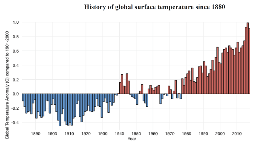
Yes. The average temperature on the planet has risen more than 1.5 degrees Fahrenheit (0.9 degrees Celsius) since the late 1800s, with most of the increase occurring more recently. Scientists measure temperature in thousands of locations around the globe to track air, surface, and ocean temperatures. You can read about how they currently calculate the Earth’s average temperature, as well as the history of the measurements here at the Earth Science Division of NASA’s Goddard Institute for Space Studies. Also, here is a climate data primer from the National Oceanic and Atmospheric Association. As you explore data and hear reports of the temperature, be sure to note if they are measuring temperature in Celsius or Fahrenheit. The figure below shows temperature anomalies (in degrees Celsius) over time (since 1880) — that is, differences from the 1901-2000 average global temperature (see the description on the Y-axis, the vertical axis, the one that goes up and down).
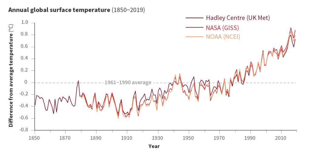
Below is another figure showing similar trends with a slightly longer history, a slightly different average line, and analysis by three independent groups of researchers (from the US Academy of Sciences, Climate Change: Evidence and Causes, 2020 Update:
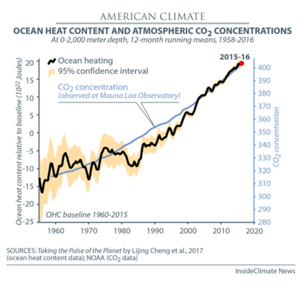
The rise in ocean surface temperatures also corresponds to the increase in atmospheric CO2 and other GHG emissions (see below). In the figure below, the black line is the change in ocean temperatures relative to the average across 1960-2015. The trend is one that clearly shows the warming of the ocean. The yellowish band represents the 95% confidence level of the statistical analysis. The wider the band, the greater the range of values around the black line that could occur without being attributed to a statistical anomaly. Since 2000, the yellow band narrows around the black line to the point where is virtually not visible. This means that scientists are increasingly confident that the measures are highly accurate. The blue line represents the levels of atmospheric concentrations of CO2 as measured at the Mauna Loa Observatory (see more below).
EVIDENCE
- On average, the surface air temperatures of the planet as a whole have increased
- The average surface air temperatures of the U.S. have risen
- The temperatures of the upper levels of the ocean have increased.
- There are more severe and more extreme climate events, such as unusually high temperatures, compared to the past 100 years. (click here for data)
- Nine of the ten hottest years on record have occurred since 2005.
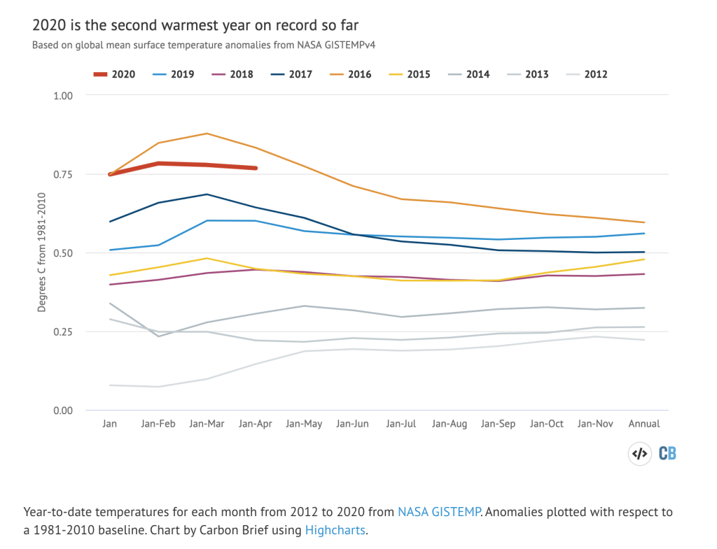
2020 is on track to be one of the hottest years on record.
“Average” — You are likely familiar with that word but let’s review what it means in this context. To calculate an average, you take the sum of all the values and divide it by the number of values. So if your five values were 10, 5, 5, 2, 20, you would add them together and get 42. Divide that by five (the number of values) and your average would be 8.4. When talking about the average temperature of the planet, that means some areas will record higher temperatures, some lower. When talking about the average temperature over time, some days, months, or years will be higher, some lower. The average informs us of the trends. So, a cool summer day or record snowstorm is only a single value, a single measuring point, and can be an anomaly (a rare deviation). Climate scientists measure longer-term trends, often 30-year averages.
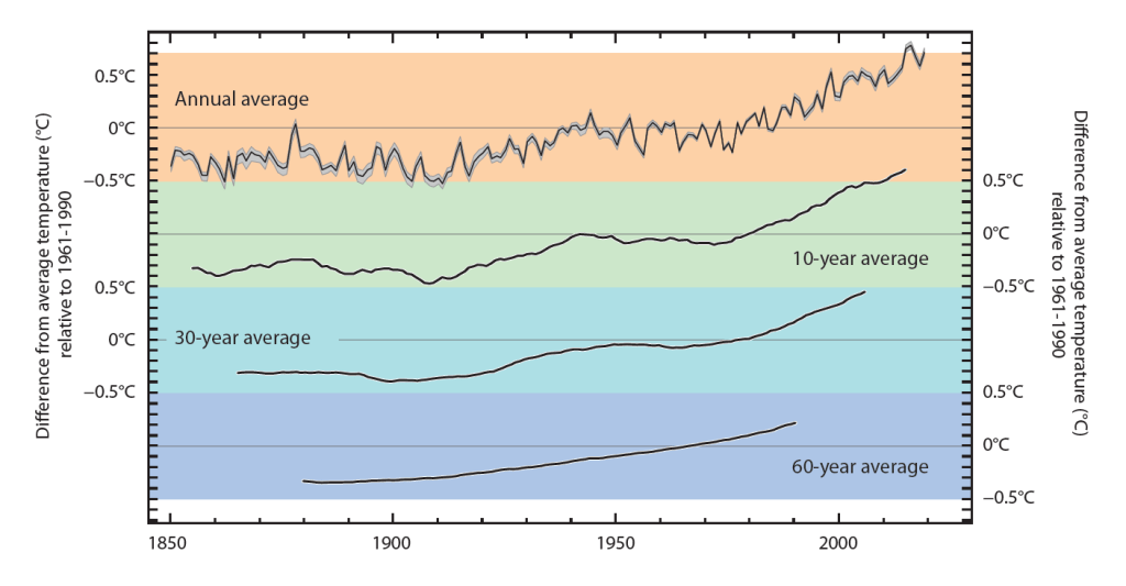
The figure below from the National Academy of Science illustrates the differences in how data is averaged. The top line is jagged and each data point represents the average for an individual year (smoothing our monthly variability). The next line, in the green band, is ten-year running averages. So, each data point represents the average temperature of the five years before and the five years after that date. The line becomes smoother and makes some of the longer trends clearer. The last two lines in the blue and purple bands do the same as the ten-year average but for 30- and 60-year averages, further smoothing the line but maintaining the trend.
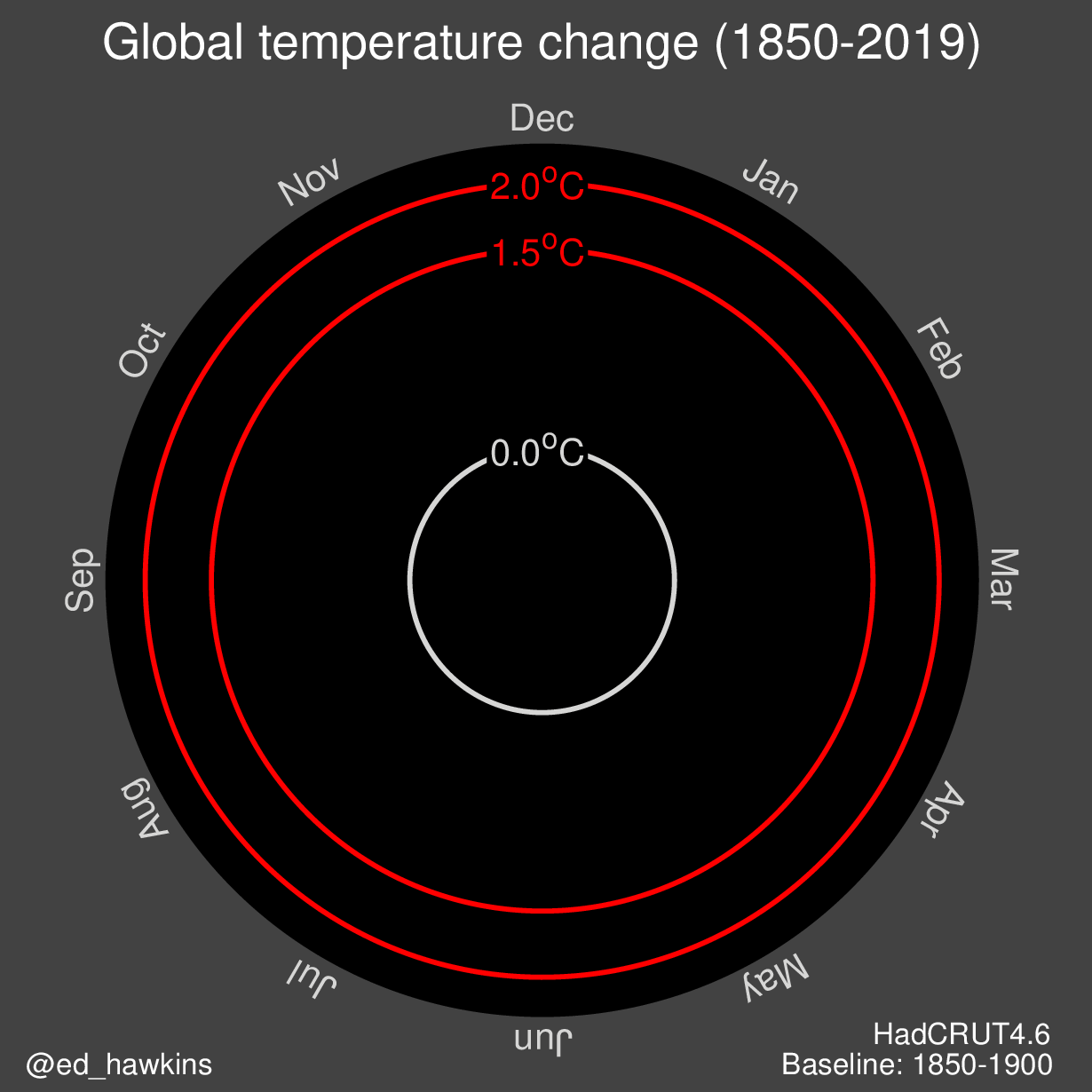
Below are several visuals showing the change in recorded temperatures over time (since 1850).
Below, each circle represents a country and the color of the circle changes over time (1880-2017) as anomalies emerge compared to the average temperatures between 1951 and 1980. While it is difficult to see the names of individual nations, watching the overall pattern shift over time from many blues to all orange or red shows increasing temperatures in every nation. You can find an additional link to the gif here.

–
–
