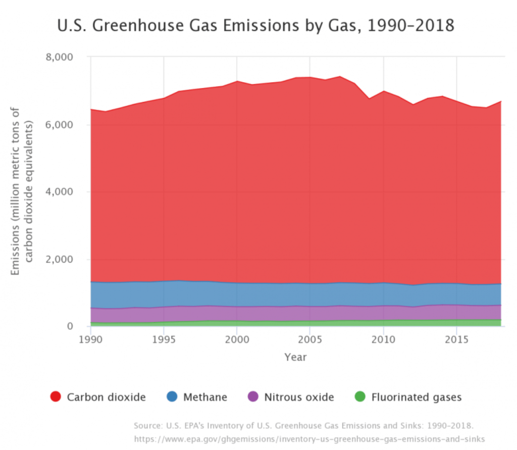
The primary anthropogenic greenhouse gases are carbon dioxide (CO2), methane (CH4), nitrous oxide (N2O) and fluorinated gases. The image below shows the trends in US GHG emissions per gas from 1990 until 2018. Next, we examine each gas individually.
CARBON DIOXIDE
Carbon dioxide is the most prevalent anthropogenic greenhouse gas. The direct emitting of CO2 makes up 65% of global GHG emissions and another 11% of CO2 is added from land-use changes and deforestation that detract from CO2 absorption by plant life. In the US, CO2 made up 81% of emissions (in 2018). The rapid increase in concentration of CO2 in the atmosphere is driven primarily by burning fossil fuels (oil, coal, and natural gas), but also by wildfires, deforestation (trees absorb CO2 so fewer trees means more CO2), and land-use changes like urbanization and agriculture.
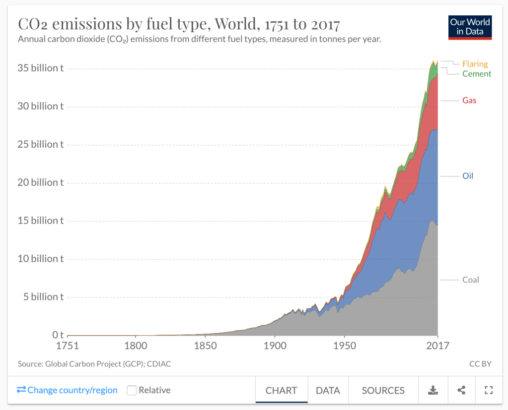
In the figure below from Our World in Data shows the contributions to CO2 emissions by different types of fossil fuels, as well as cement production and flaring of gases during production, since 1751. Click on the image to go to the original source. A rapid increase is evident, especially after 1950.
Carbon dioxide is invisible to the human eye but below are three visualizations that allow us to see it. The first two are from NASA. What is largely visible in the video is that different locations on the planet produce dramatically different amounts of carbon dioxide emissions. The US, Europe, and China are clearly visible sources of the global CO2 (more on this later).
The final video uses a special camera and filter to show direct emissions sources on a more local and individual scale – to see how prevalent CO2 is in our day to day lives.
Carbon dioxide is also emitted from volcanos and from human and animal respiration (when we simply breathe out). It is the rapid increase of concentrations of CO2 in the atmosphere that concerns scientists and has contributed to global warming. Scientists agree that such an increase has come from human activities since the advent of the industrial revolution in the mid-1700s with particular growth in CO2 concentrations since the 1950s.
There are several ways that scientists measure the levels of CO2 in the atmosphere. Since 1958, scientists at the Scripps Institution of Oceanography in Mauna Loa, Hawaii have directly measured the CO2 parts per million (ppm) in the atmosphere (number of molecules of carbon dioxide divided by the number of all molecules in air). You can see below that since 1958, the ppm has increased from around 318 up to 414.5 (as of March 2020). There are now many more stations around the world measuring levels of CO2 in the atmosphere.
By the way, scientists argue that we need to stabilize the atmospheric levels of CO2 at 350 ppm in order to live in the climate to which we are accustomed. James Hansen, a NASA scientist that sounded some of the earliest alarms about climate change and global warming, had this to say back in 2008 about the ppm of atmospheric CO2 “If humanity wishes to preserve a planet similar to that on which civilization developed and to which life on Earth is adapted, paleoclimate evidence and ongoing climate change suggest that CO2 will need to be reduced from its current 385 ppm to at most 350 ppm.”
The red line in the figure below shows the monthly averages of CO2 ppm concentrations and the black line the trend accounting for seasonal cycles. The red line is jagged, going up and down, because the northern hemisphere has a lot of land mass and vegetation. During the spring and summer months of the northern hemisphere, when more plants have green leaves and are growing, more CO2 is absorbed by the plants and the red line dips. It goes back up during fall and winter when there is less green vegetation in the northern hemisphere. Measures for the average global level of CO2 from more measurement stations besides Mauna Loa follow a similar trend and are currently around 412 ppm.
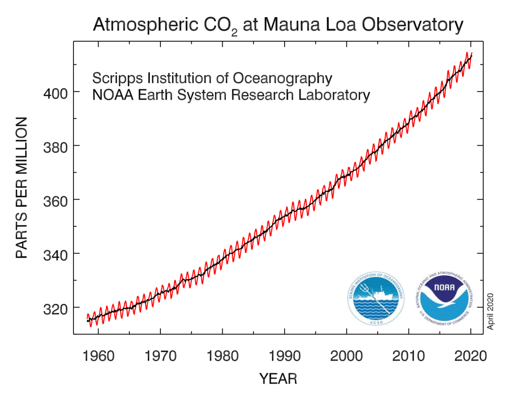
The graph above is often referred to as the Keeling Curve, named after the scientist who started the measurements back in 1958. For more of the history of Charles David Keeling (he died in 2005) see here. The measures from the lab at Mauna Loa are the longest continuous record of direct measurements of atmospheric CO2. That means the measurements were taken from the air in real-time. This differs from indirect measures of atmospheric concentrations of CO2 in the much-distant past.
To measure levels of CO2 in the distant past, prior to the scientific tools of today, researchers draw from ice cores drawn from ancient glaciers that trap bubbles of the atmospheric conditions when that level of the glacier was formed. Many of these cores are stored and analyzed in the National Ice Core Lab in Colorado. The video below shows and explains much of this work.
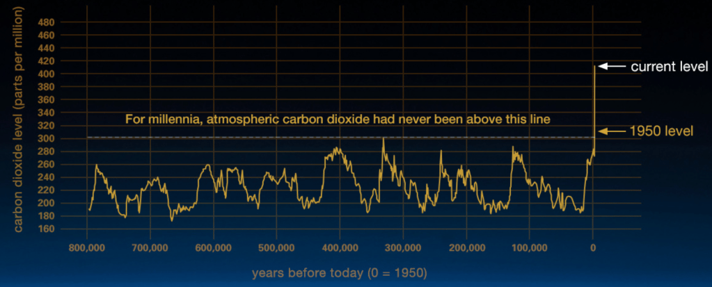
This type of research allows scientists to then map out the levels of CO2 in the atmosphere going back several hundred thousand years. Are the current trends we see different or similar to the past? Is this part of a natural fluctuation that is visible in past trends?
The video below puts together peer-reviewed ice core data as well as the Keeling Curve and recent modern data. It starts in the current era (1979-2016) and eventually works way back in time. The trend lines change color as the source of measurement changes. The scale of CO2 ppm on the y-axis changes as the animation progresses. On the left of the initial screen, it shows measurements from numerous stations around the globe. On the right side of the screen, it shows a small world map of those stations as well as the average trend line. You can initially see the year just under the map. It starts in 1979 and initially moves forward to 2016. You should primarily pay attention to the right-hand side.
Once the orange line appears, the data from then on is from ice cores and moves back in time more rapidly. Notice that the ppm of atmospheric CO2 drops precipitously, down to 278 ppm during preindustrial times. Going back 800,000 years, atmospheric concentrations of CO2 are never over 300 ppm — that is, not until after the the industrial revolution. Remember, we are now at 412 ppm! We have been over 300 since 1950. Go back and watch it again so you have a good understanding.
Below is a still image of the same data from NASA. The conclusions are the same, atmospheric CO2 concentrations are unprecedented.