What does climate change have to do with justice? Isn’t it an environmental problem? An energy problem? A global problem? Yes, but it is also a problem that needs to be viewed through the lens of justice. This section explores the logic and debates about climate justice. What is climate justice? What does climate justice look like from a global, national, and socio-economic class level? What are the complexities of climate justice?

The most basic principle of justice is rooted in fairness and holding those who cause harm responsible for their actions. If someone harms another person or their property they can be fined or jailed. Justice can also refer to the fair distribution of benefits or harms. For many, growing levels of income inequality in the US seem unfair, unjust. It is unjust that communities of color in the US are more at risk of toxic exposure from hazardous waste sites, garbage incinerators, and heavy industry. The principles of fairness and justice argue that such burdens of harm should be shared by all that benefit from the “goods.” I’ll come back to more subtle analysis later. First, let’s begin to examine the various ways that justice applies to global warming and climate change. To pursue justice, one must first determine who is responsible.
The term “global warming” captures the global nature of rising temperatures as a consequence of human-generated fossil fuel emissions and other greenhouse gases (GHGs). However, using the term global or a collective “we” to refer to the human activity that is the source of the global warming glosses over important and dramatic variation in the causes of the problem. Humans, collectively, have not contributed to the problem in equal ways. Nations and people within them have different ways of living, different levels of consumption, and different capacities to adapt to the consequences of climate change. The world is full of inequalities and the causes and consequences of climate change interact with those structural inequalities.
Let’s start by looking at the distribution of the causes of global warming. Remember that the primary sources of GHGs are the burning of fossil fuels in transportation, the production of electricity, and industrial manufacturing; the use of nitrogen-based fertilizers in industrial agriculture; digestive processes of domestic livestock, particularly cattle; and the use of chemical refrigerants. [For a more detailed review of the primary GHGs and their sources refer back to THIS page.]
BY NATION
The most straight forward way of looking at GHG emissions is by nation. In this day and age, the world is organized into sovereign nation-states. It hasn’t always been that way nor is there anything “natural about it. See this sociology article for more on the formation of the nation-state system in the world. It is within these nation-states that policies to address global warming will be formalized and implemented (even if they are influenced or directed by global-level agreements).
The bar chart below (from the Global Carbon Atlas) shows the 2018 territorial CO2 emissions of the top-20 emitting nations. The colors of the bars represent different regions (Europe, Asia, etc.). As you can see, China emits the most CO2, followed by the US, India, Russia, and Japan for the top five emitters. Germany, Iran, South Korea, Saudi Arabi, and Indonesia round out the top 10. China emits more than twice as much as the US, which emits more than twice as much as India.

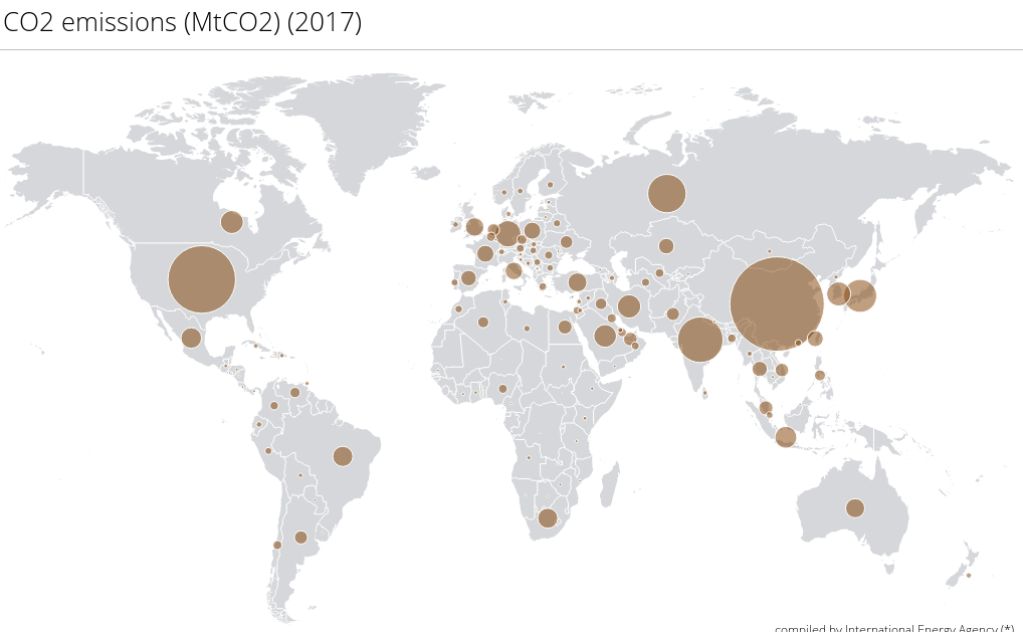
Using 2017 data, the map below, from the International Energy Agency (IEA) illustrates the proportional carbon dioxide emissions from fuel combustion by country. When looking at each nation’s contribution to global emissions, it is evident that some nations emit more (much more) than others. In the map below, the size of the dots barely registers for most African nations. Several South American nations, Scandanavia, and southeast Europe nations have noticeably smaller contributions to total emissions. China, the US, India, and Russia clearly make the largest contributions to the “global” total. Just those top four countries together account for over half of the global emissions.
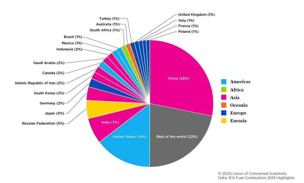
A final way of looking at nations’ contributions is through a pie chart. The chart below is from the Union of Concerned Scientists using IEA data. According to this data, the top-20 emitting nations account for 78% of global emissions while the remaining 175 countries account for only 22% of global emissions.